Founded in 1941, The Sacramento County Employees’ Retirement System (SCERS) is a defined benefit retirement system dedicated to ensuring Sacramento’s public servants have access to financial security and an opportunity to achieve their retirement goals.
As an organization, SCERS is extremely customer-focused. However, the constraints of their old site were not letting this shine through. SCERS came to PensionX seeking a new website that could lead the charge in modernizing its systems, proactively guide its members through all stages of retirement, and offer quick answers on any device.
Modern and refined, SCERS’ new website has been turning heads since its launch, but more importantly, the results have been outstanding.
- Overall visits to the website have grown by 25%.
- Pageviews have grown by 58%.
- Organic search traffic has grown by 31%.
- Pages per session are up by 27%.
- Mobile visitors are visiting 29% more pages per visit.
Look below to learn about a few of the more impactful elements of this project.
Modern, member-centered design
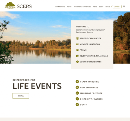
Driven by the SCERS’ customer service mission, we utilized exploration exercises, stakeholder surveys, advanced analytics analysis, and more to understand what members were looking for in the new website. The result is a streamlined homepage that allows members to quickly take action, discover how to proactively manage their retirement when life takes a turn, and keep up with the latest news.

Information architecture and content strategy
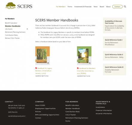
For a retirement system website, the information architecture and content strategy are the user experience. Visitors typically visit their system’s website with a specific question in mind and precious little time to research it. By frontloading the project with user research and following up with SCERS’ communications team, we were able to develop an intuitive information architecture that delivers results. Since the site launch, top landing pages are seamlessly driving visitors to the right assets and forms while reducing the sitewide bounces by 7%. This translates into valuable time savings for SCERS’ customer service team.
Note: If you have questions about best practices regarding information architecture or would like insight into how we look at the problem, contact us. We’re always happy to help.

An outstanding mobile experience
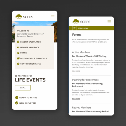
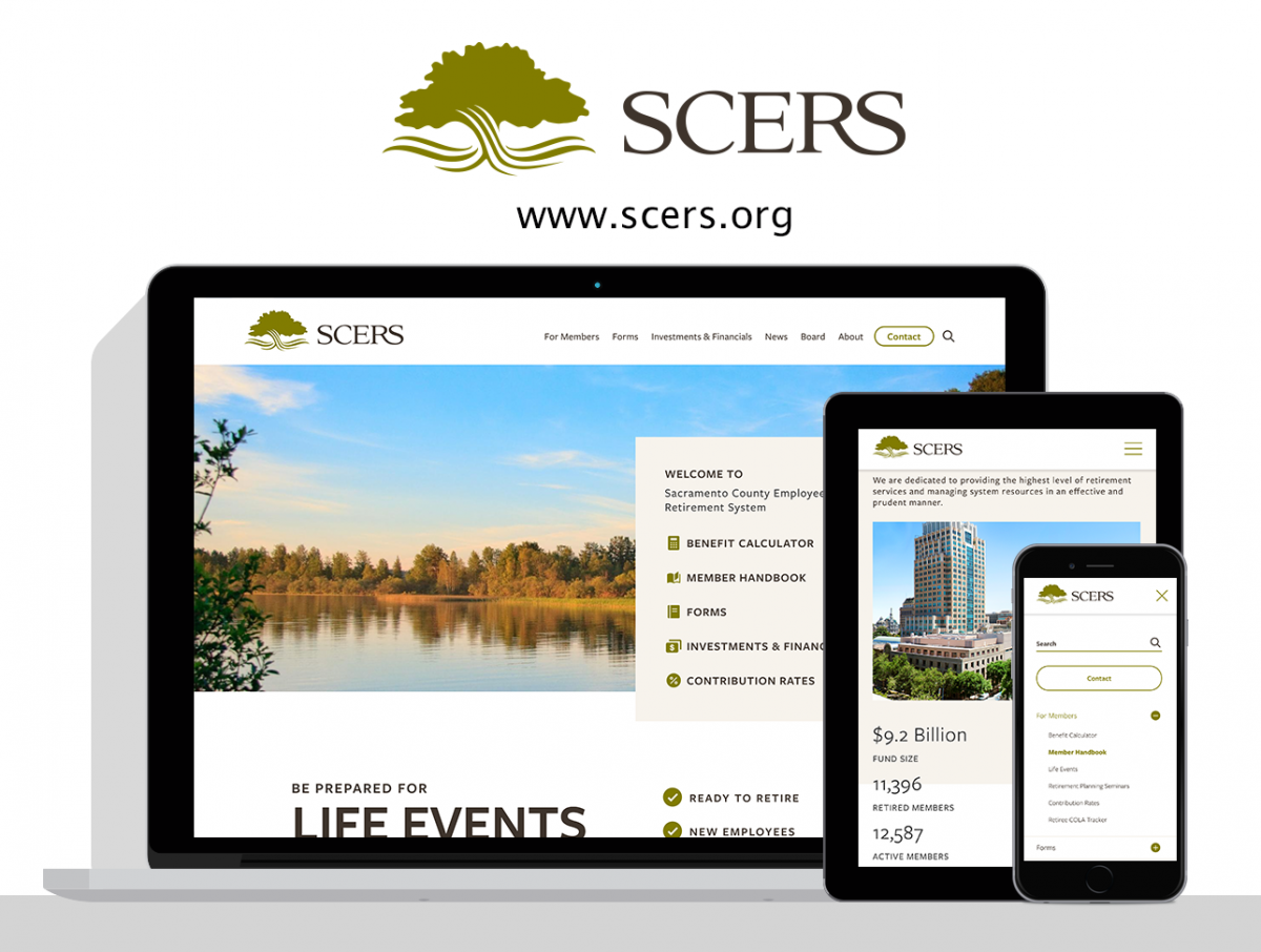
It was key that we deliver an outstanding experience on every device. With the new website, we’ve now made it easy for members to research their pension in the office, at home, or on the go.

Setting the stage for future modernizations
The new website is just the first of a number of modernization initiatives that SCERS is embarking upon. By partnering with SCERS’ other vendors and listening to their needs throughout the design process, we were able to deliver key assets that SCERS can use to maintain a unified user experience in each of their future projects.
We’re so proud of what we were able to accomplish together with SCERS’ team and are excited to watch how the new design will continue to affect their members. If you have a project with similar needs, let us know. We’d love to learn more about it and walk you through a free demo or consultation.
