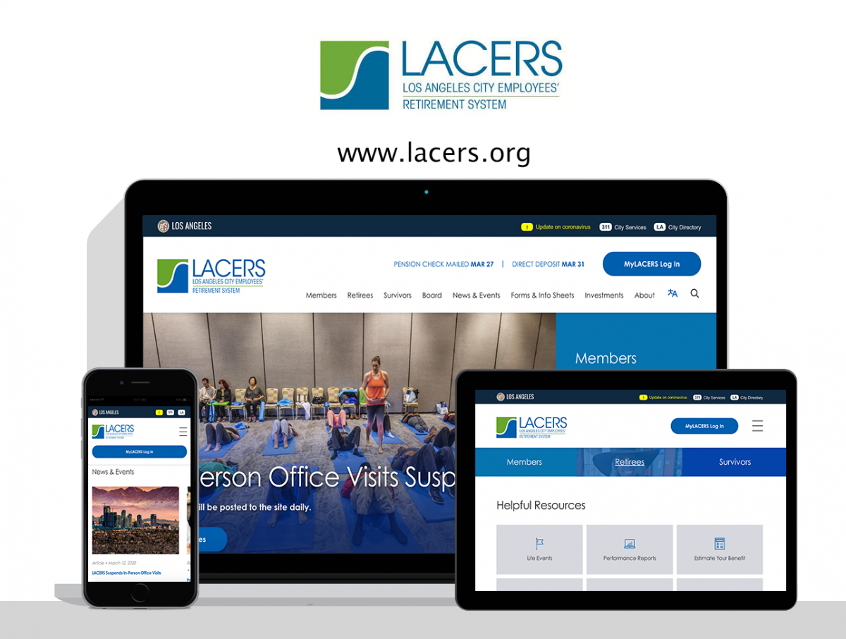
Established in 1937, The Los Angeles City Employees’ Retirement System (LACERS) provides pension benefits and administers a retiree health care program to more than 26,000 active city employees and over 20,000 retirees and their beneficiaries.
After years of dealing with an outdated website and complicated content management tools, LACERS came to PensionX, seeking a new pension website and online platform that would empower them to transform their customer experience online.
Read on to discover a few of the more impactful elements of this project.
Data-driven design
Informed by our experience in working with pension systems across the country, Google Analytics data, and authentic customer feedback, every element of LACERS’ new website design is optimized to assist active members, retirees, and other beneficiaries and make their lives better.
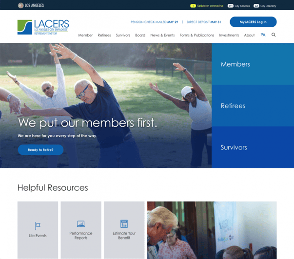
Custom icons draw attention to top-requested resources. Organizational stats illustrate the size and impact of the fund. News titles bring breaking developments to life. From the personalized member quick links to highly visual system spotlights, the new design gives LACERS the opportunity to proactively assist visitors at every turn in a modern, stunning way.
Brand and identity
LACERS is an innovative, customer-focused organization that serves the second-largest city in the country. They needed a website that reflected each of these key elements. To begin, we brought in the Century Gothic font family to nod to their modern, forward-thinking identity. Further extending the brand, we strategically used variations of LACERS’ blue to call attention to important items and prompt action. When it came to imagery, we helped the team curate a careful mix that reflected their membership and the city they lived in so members would instantly feel welcome and encouraged to explore when they arrived at the site. Beyond this, we assisted the team by providing guidance on when and where stock photography could be strategically sprinkled in for news items and other timely elements. The result is a site that feels alive, fun, helpful, and most importantly, on-brand.
Information architecture and content strategy
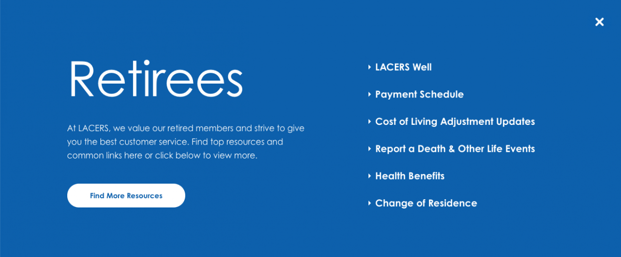
For a retirement system website, the information architecture and content strategy are the user experience. Visitors typically visit their system’s website with a specific question in mind and precious little time to research it. By front-loading the project with user research and following up with LACERS’ communications team, we were able to develop an intuitive information architecture that delivers results. This translates into valuable time savings for LACERS’ customer service team.
Note: If you have questions about best practices regarding information architecture or would like insight into how we look at the problem, contact us. We’re always happy to help.
Alerts and notifications
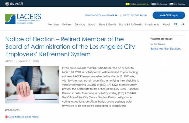
Having worked with several other Los Angeles city and local government websites, we were well acquainted with LA’s alert bar, which creates a unified platform to display the city’s critical alerts and contact details. The site integrates this technology seamlessly within the design.
Section 508 and WCAG 2.1 compliance
From design to technical implementation, we worked closely with LACERS’ team to ensure users with disabilities can navigate the site with ease.
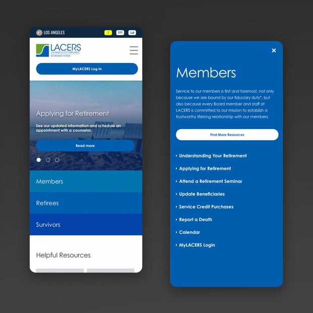
Mobile-first, responsive design
From reviewing a handbook to calculating retirement estimates or even just catching up on a planning seminar, LACERS’ new website makes managing retirement a breeze on any device.
Easy content management
Our system brings together the power of Drupal, the #1 enterprise content management system, with an enhanced usability layer for site editors. LACERS’ team is now empowered to communicate with ease.
Let’s work together
We’re so proud of what we were able to accomplish together. If you have a project with similar needs, let us know. We’d love to learn more about it and walk you through a free demo or consultation.
